IMF Internal Newsletter Redesign
Time: 3 months, 2021
Skills: Wireframing, Prototyping, UX Research, Design Component Library Management, Mobile Newsletter Design
Team: Chloe Phan (Lead Designer), Stefan Lipsky (Icon & Header Designer),
Ken Nakagawa (Art Director), Felipe Leon (Art Director)
Skills: Wireframing, Prototyping, UX Research, Design Component Library Management, Mobile Newsletter Design
Team: Chloe Phan (Lead Designer), Stefan Lipsky (Icon & Header Designer),
Ken Nakagawa (Art Director), Felipe Leon (Art Director)

1—Overview
Design Brief
The IMF has a series of newsletters that is distributed weekly or monthly among internal staffs. Historically, these newsletters have been plain PDF export of Word documents. Now, in an effort of modernization, the IMF Creative team was tasked with a Rebranding and Redesigning of this set of internal newsletters. In my capacity as a Brand & Graphic Designer, I led the Discovery, UX Research, Wireframing, Prototyping, and Stakeholder Communications phases throughout the project’s timeline.
Background
Design Brief
The IMF has a series of newsletters that is distributed weekly or monthly among internal staffs. Historically, these newsletters have been plain PDF export of Word documents. Now, in an effort of modernization, the IMF Creative team was tasked with a Rebranding and Redesigning of this set of internal newsletters. In my capacity as a Brand & Graphic Designer, I led the Discovery, UX Research, Wireframing, Prototyping, and Stakeholder Communications phases throughout the project’s timeline.
Scope of Work & Explanations
The project had an initial 1-month timeline, and was extended for 2 more after getting the greenlight from stakeholders. I frontloaded all my discovery & research process in the first 2 weeks and spent the last 2 weeks in Sprint #1 to build components and test layouts. I spent roughly 4-6 hours to figure out my scope for the project, as well as conducting small user research (interviewing/chatting) that would aid my understanding of the target readers/information consumers. Here are my initial assumptions after doing a newsletter audit and considering the technical constraints of the project:
1. Readers at the Fund prefer to read email newsletter digest on mobile devices.
A mobile experience would make it easier for readers to catch up on newsletters, rather than sifting through information on a desktop device.
2. Readers at the Fund would prefer short and concise information over long and winding Word PDFs.
The nature of the work within the Fund is incredibly technical and involves lots and lots of difficult documents, whitepapers, and so on. Readers would almost certainly prefer something smaller, more manageable, and not too reminiscient of technical works when it comes to newsletters.
3. Readers at the Fund would interact more with the content if given the opportunity.
All of the audited newsletters have taglines, links, and paragraphs embedded into the document as Call to actions. However, from a reader point of view, it was very difficult to maintain a sufficient level of concentration all throughout the document. By the time the reader reaches the end of the newsletter, they felt overwhelmed and disconnected from the content and hence skipped through CTAs. Readers would benefit greatly from a redesigning and rethinking of the internal newsletter format—a process that prioritizes Readability, Variety, and Social Connection above all.
2—Process
Being a newsletter reader myself, I ran into some difficulties when trying to get through the newsletter audit. The most glaring one was that the length and the format both worked together to decrease my interest in the content. Here is a small screenshot of one of the textblocks that I worked with during my initial audit:
Existing Problem
Being a newsletter reader myself, I ran into some difficulties when trying to get through the newsletter audit. The most glaring one was that the length and the format both worked together to decrease my interest in the content. Here is a small screenshot of one of the textblocks that I worked with during my initial audit:

2—Process
Research
Target interviewees/users:
I started by asking questions and getting feedbacks from stakeholders about their experience with the IMF internal newsletters. The interviewees were:
a) stakeholders who are writers and editors to these newsletters
b) IMF staffs who are invested in the newsletter topics and are subscribed to the publishings
c) IMF staffs who are not invested in the newsletter topics but would like to become more interested and eventually subscribe to the publishings
The responses have been helpful in determining why the current newsletters did not garner enough attention and call for a more user-friendly and visually-fulfilling experience to replace the exported PDFs.
Below are the three creator/consumer types for the revamped newsletter experience— (1) IMF Writer/Editor, (2) IMF Staff Engaged Reader, and (3) IMF Staff Less-Engaged Reader:

An IMF Writer/Editor who publishes Internal Newsletter
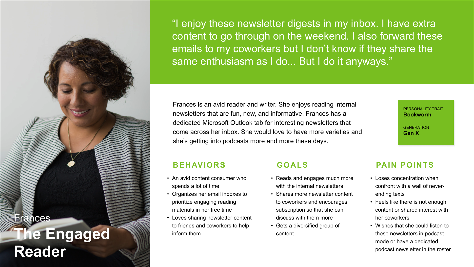

- An IMF Staff who engages with the Internal Newsletter
- An IMF Staff who skims the Internal Newsletter
2—Process
User Flows and Wireframes
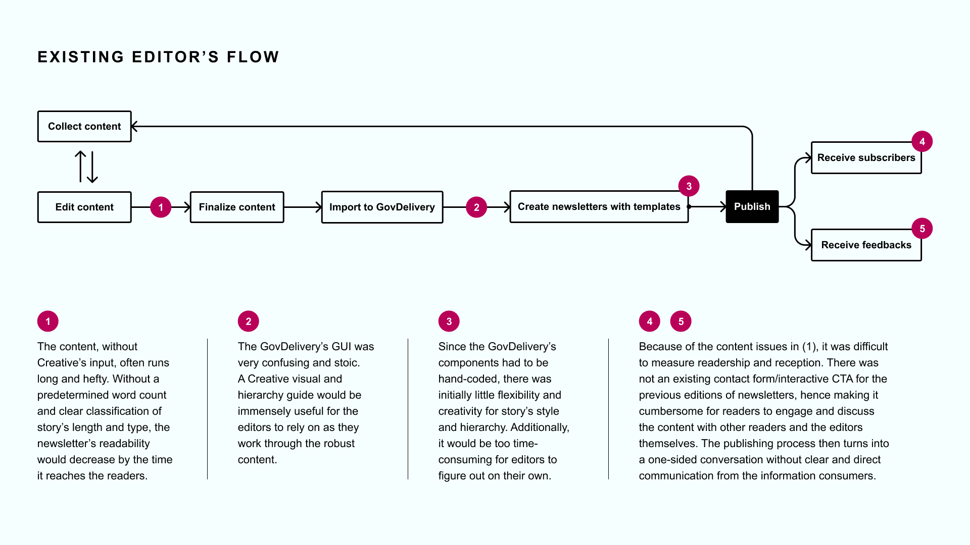
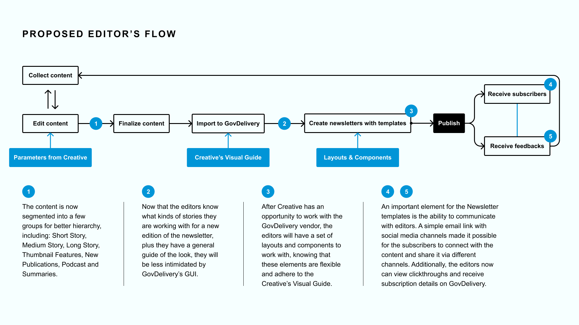
1. IMF Writer/Editor Flow
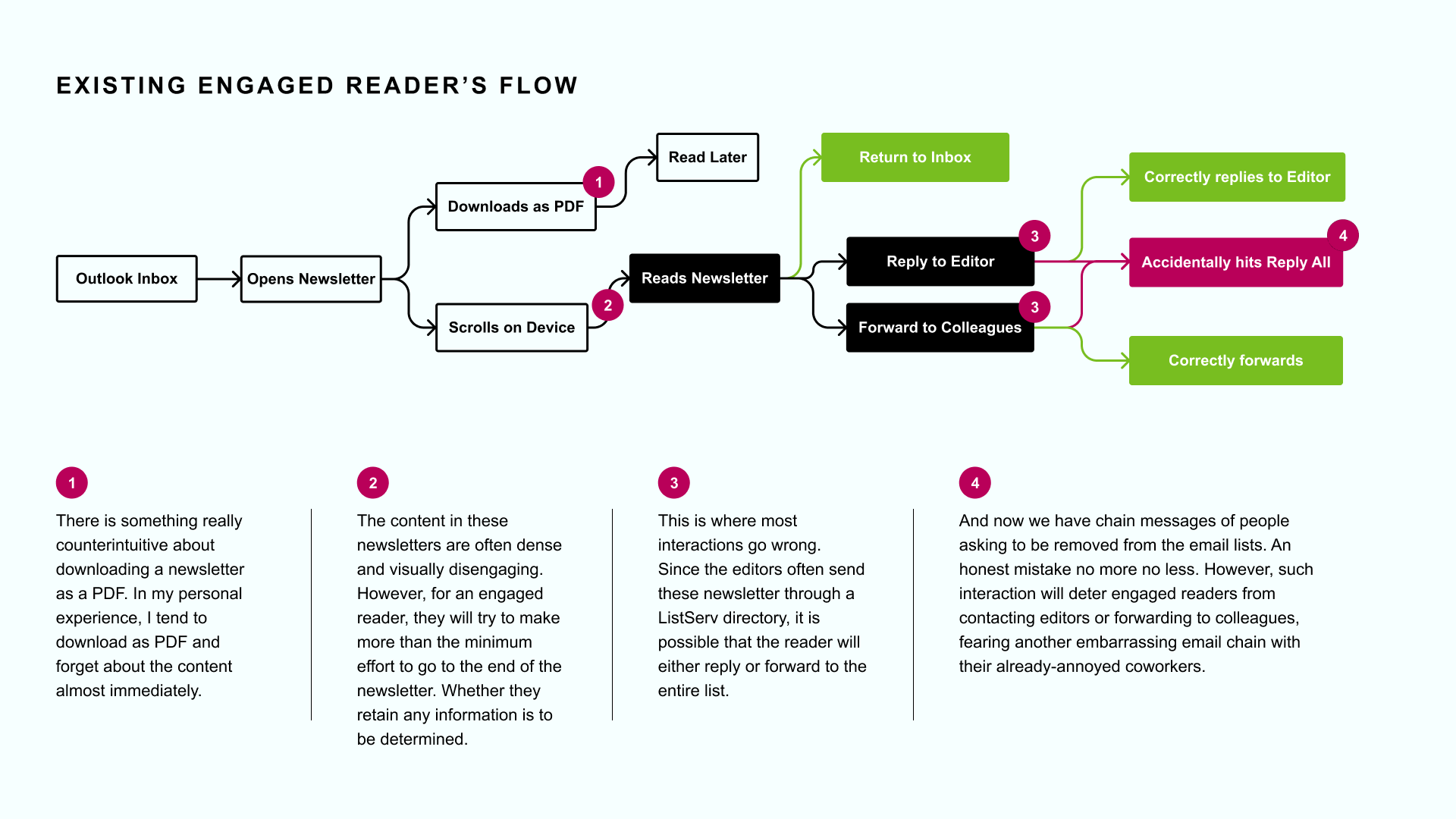
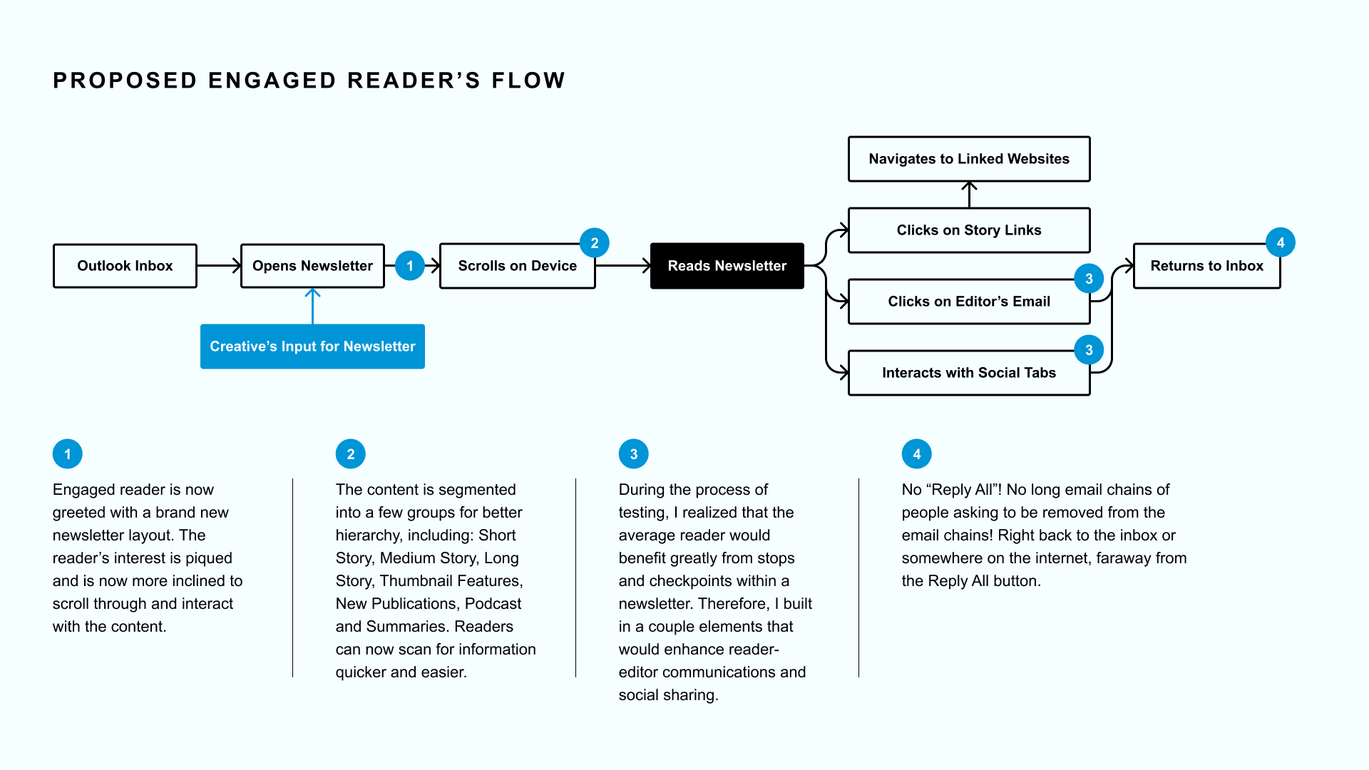
2. IMF Staff Engaged Reader Flow
3. IMF Staff Less-Engaged Reader
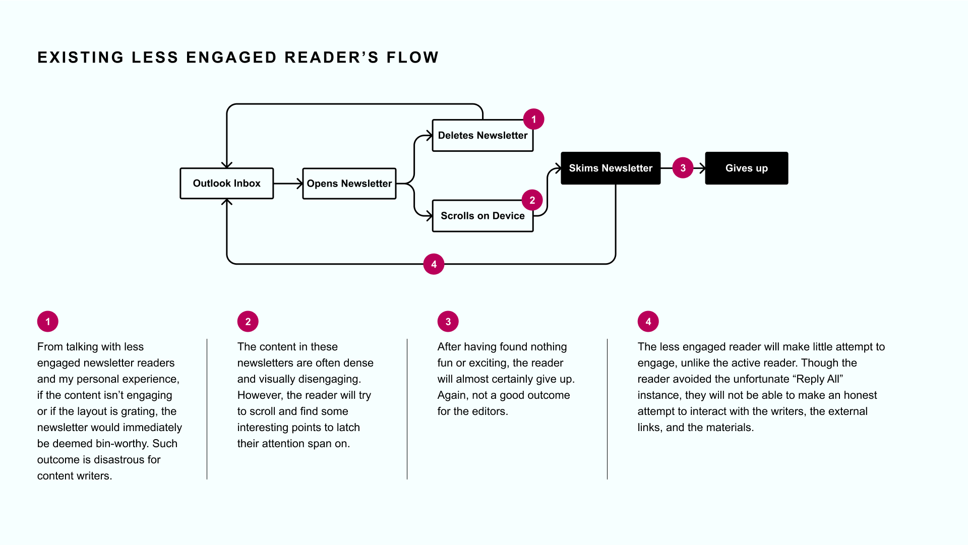
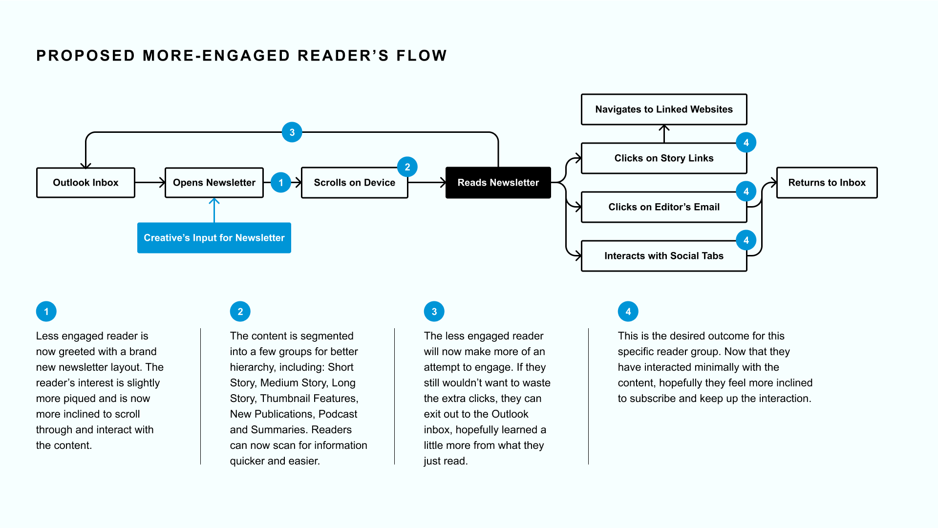
After building out two user flows for each key user, I created a couple wireframes that would aide in the creation of more polished, friendly layouts, and adaptable newsletter components.
2—Process
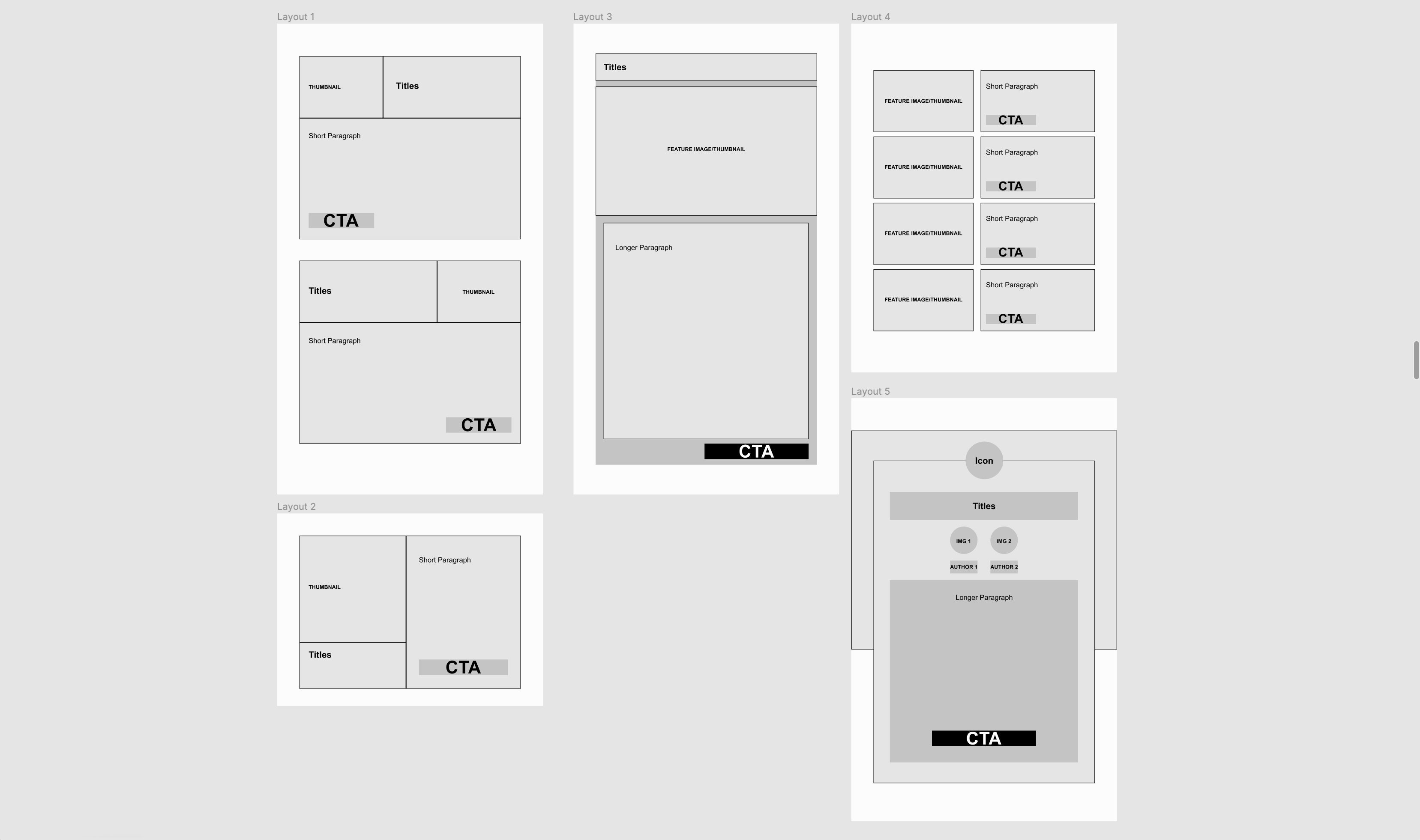
Components & Refined Layouts
Throughout the research phase, the team and I settled on a couple key elements that would really drive the reading experience forward. Here is the list of components that served as the building blocks of the newsletter redesign:
- Newsletter Header
- Welcome Note / Editor’s Note
- Short Story Component
- Medium-Long Story Component
- Thumbnail + Short Description Component
- Podcast Thumbnail with Short Description
- Editor’s Profile and Contact Information Tab
- Social Media Tabs
Newsletter Header and Editor Notes
Designer: Stefan Lipsky & Chloe Phan
Designer: Stefan Lipsky & Chloe Phan
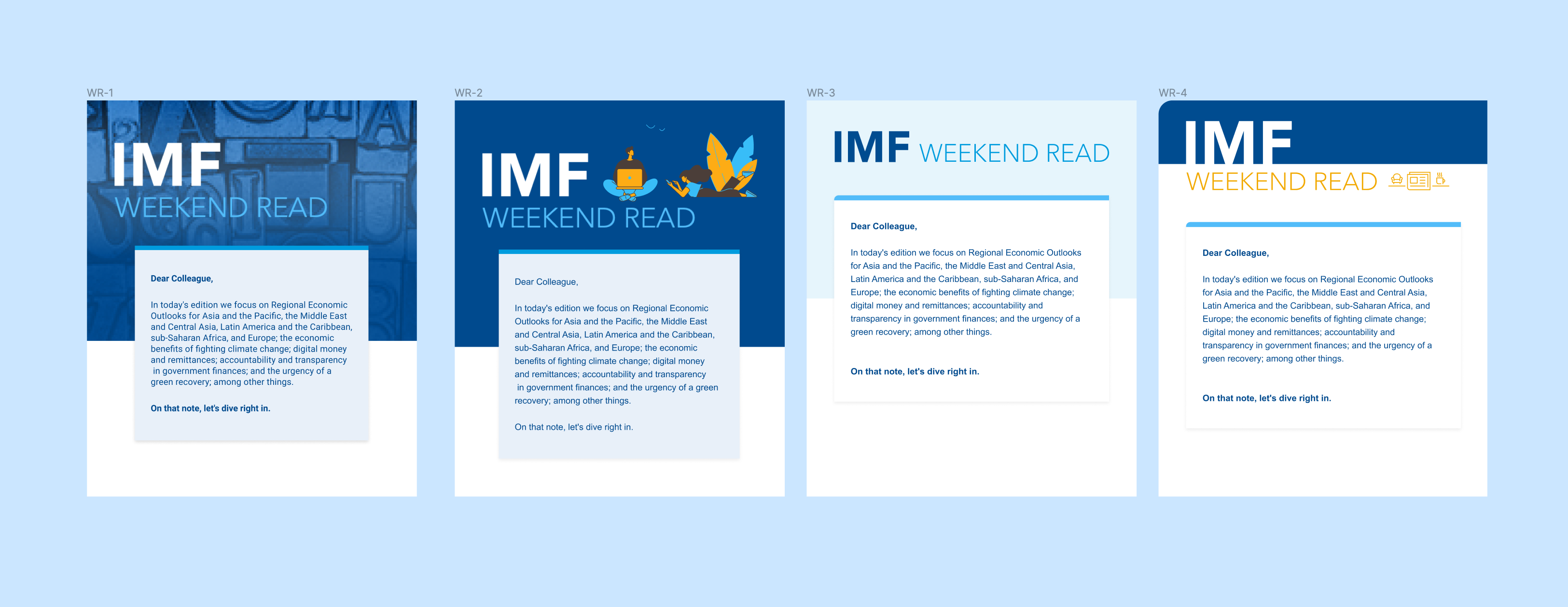 Newsletter Header design style through different phases of testing and iterating
Short Story Component
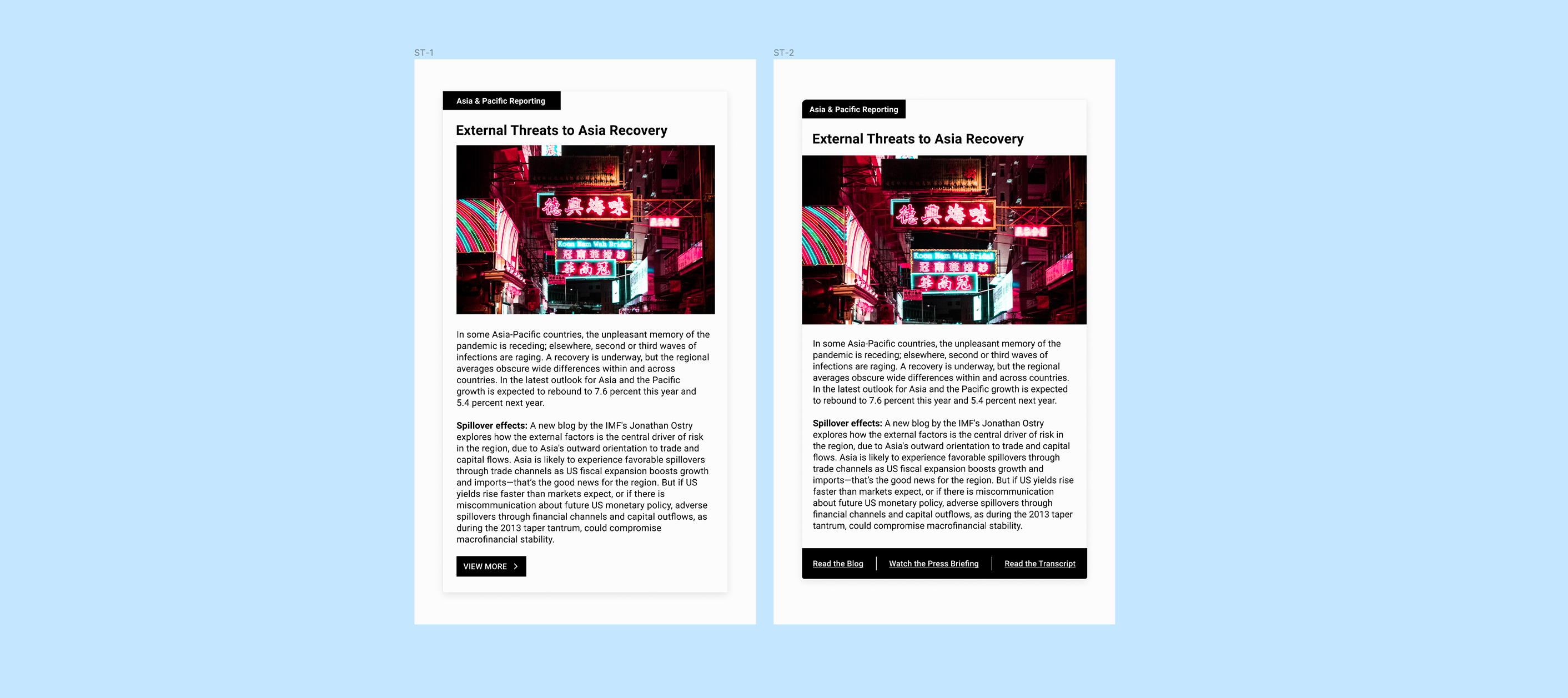
Short Story Components designs with different setting for interactive details
Thumbnail + Short Description Component

Thumbnail and Description designs with Roboto Slab and Arial for stakeholder reviews and visual A/B testings
Medium-Long Story Component
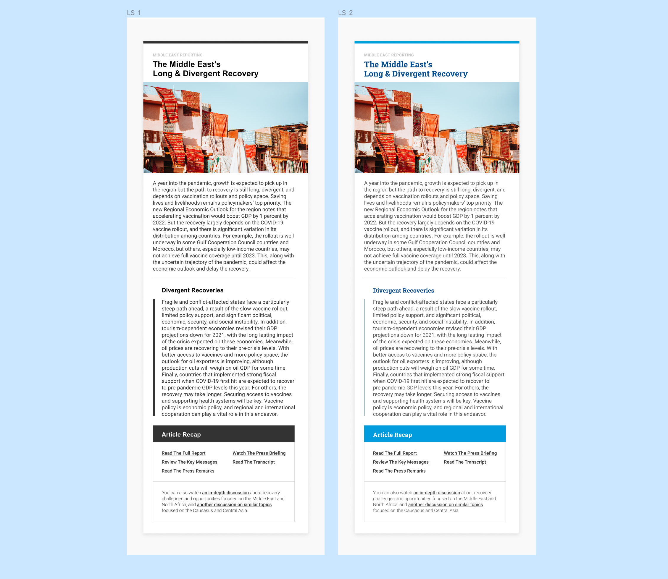
Medium-Long Story designs for user and visual A/B testing in black and white vs. IMF brand colors
Social Media and Editor’s Contact Tabs
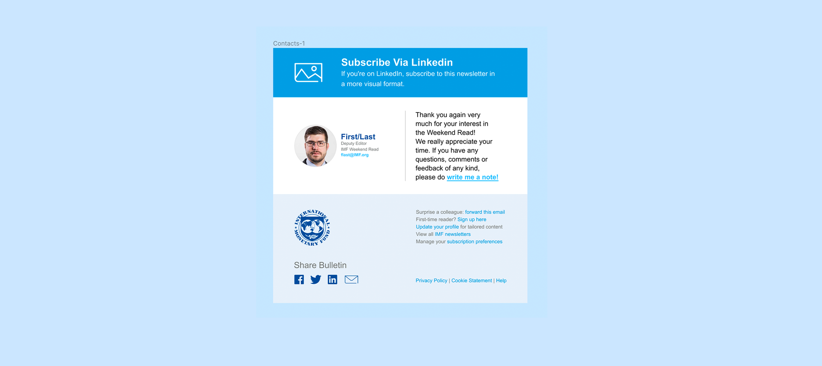
Contact tabs that allow readers to interact with the editor and other social media functions
3—Result
IMF Internal Newsletter Redesign: New Look
Abstract
The IMF Internal Newsletter Redesign Project is a suite of 6 Newsletters+ for IMF Staffs, including: IMF Weekend Read, IMF F&D, and IMF Podcasts. The suite aims to increase internal readership, provide user-friendly reading experience on mobile interfaces, and to create a more informed and engaged IMF reading community.
The IMF Internal Newsletter Redesign Project is a suite of 6 Newsletters+ for IMF Staffs, including: IMF Weekend Read, IMF F&D, and IMF Podcasts. The suite aims to increase internal readership, provide user-friendly reading experience on mobile interfaces, and to create a more informed and engaged IMF reading community.


Newsletter Components
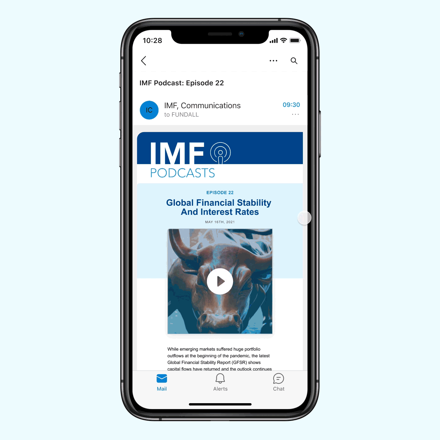
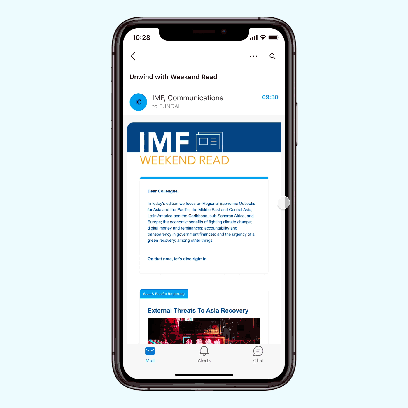
Newsletters in action
Trade-offs—
The IMF Internal Newsletter Redesign Project is designed with IMF Organization Branding as opposed to the IMF Creative Branding. Additionally, instead of building in a creative and modern newsletter design application, the Newsletter suite was designed, composed, and shipped using GovDelivery. The constraints are as follow:
1. Newsletter Design System: Since the IMF Creative Branding uses Avenir Next family for all typography needs, the team did not manage to secure a web-based license for the font family. Additionally, for ease of display across multiple operating systems, mainly Windows OS, we decided to go with Arial for all typography usage.
2. Newsletter Delivery Service & Non-Designer Learning Curve: After convening with the GovDelivery vendor, we decided to simplify the layout designs since: a) the GUI of GovDelivery and premade templated components did not allow for more elaborate text layouts, and b) it would create a learning curve for IMF editors when they attempt to build or replicate the layout designs. Taking all of the technical limitations into consideration, I made changes and created design guides that are friendly for non-designers to embark on the Newsletter projects.
Opportunities—
There are a couple things that I wished the projects could expand more into.
1. I believe that with more flexible newsletter delivery system, we could have pushed the designs even further and closer to initial expectations.
2. Additionally, I wanted to run a small set of workshops to familiarize both readers and editors on how to actively engage with newsletter contents.
3. Even though it was not possible to secure a license for Avenir Next nor was it realistic to apply Avenir Next into these Newsletter designs, I wished that I had more free reign in testing out font families that have a similar feel to Avenir Next and had more flexibility to break the corporate feel of these newsletter. With that being said, I believe that the Header designs that Stefan and I conducted somewhat filled the gap of being locked out from our brand’s font family. Two sage lessons from this experience would be to have a couple alternatives to fall-back on and to have a more open-minded approach to system fonts that are reliable across different operating & email systems.